In 2026, there is no longer a debate about whether your website needs to be responsive. It simply must be. Over 60 percent of global web traffic now comes from mobile devices, and in many markets that number climbs above 75 percent. Google has been using mobile-first indexing for all sites since 2023, which means the mobile version of your website is what gets evaluated for search rankings. If your site does not work well on a phone, you are invisible to search engines and frustrating to the majority of your visitors.
Having built over 50 responsive websites for clients across industries, I have seen firsthand how the responsive landscape has evolved. What used to require hacky workarounds and vendor prefixes is now elegantly handled by modern CSS. This guide distills everything I have learned into a practical, actionable resource for developers and business owners who want to get responsive design right in 2026.

What Is Responsive Web Design?
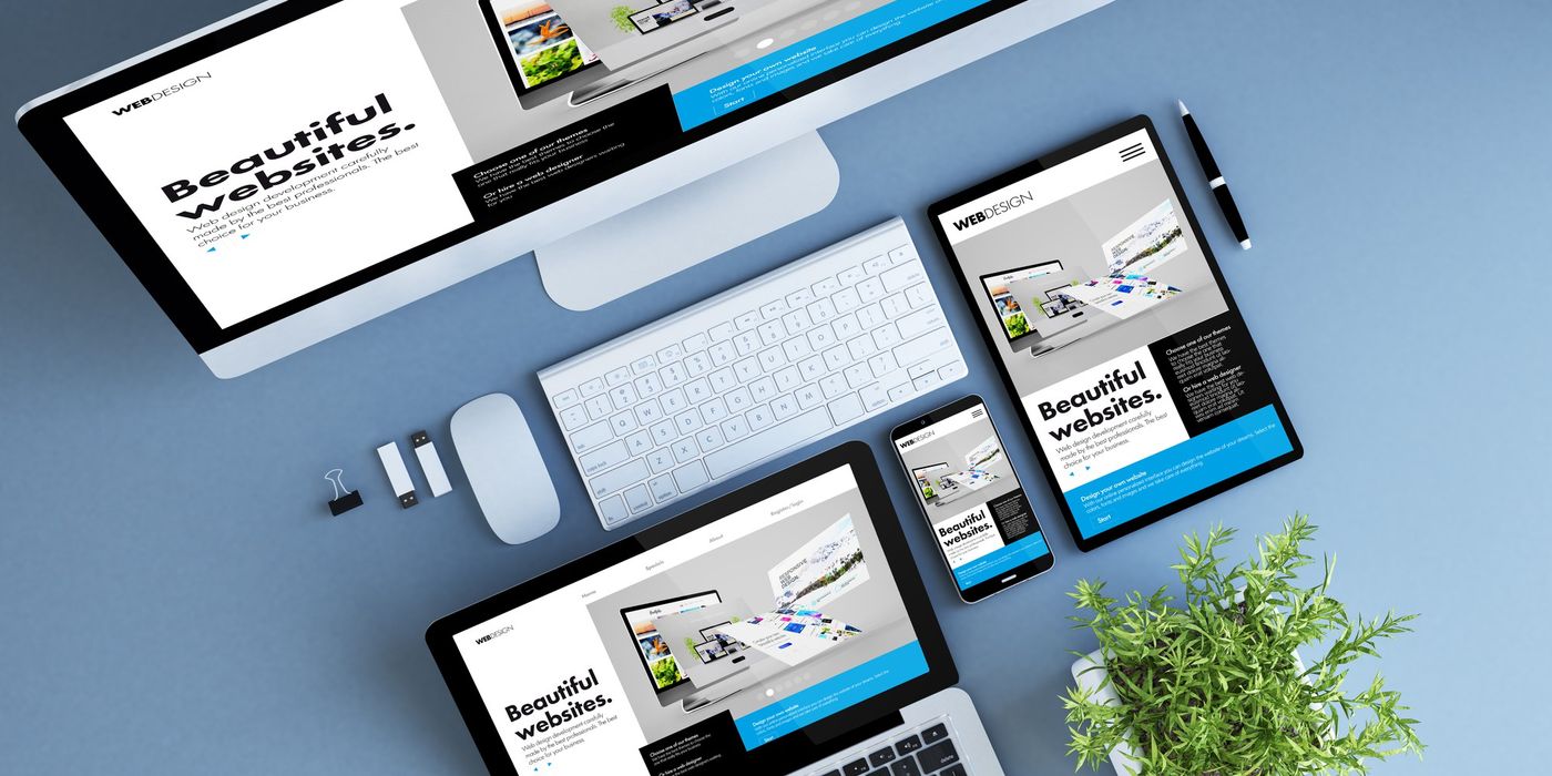
Responsive web design is an approach to building websites where the layout, images, and content automatically adapt to fit any screen size and device. Rather than creating separate versions of a site for desktop, tablet, and mobile, you build a single site that fluidly adjusts to the viewport it is displayed on. The term was coined by Ethan Marcotte in 2010, and the core principles remain the same: flexible grids, fluid images, and media queries.
What has changed dramatically is the tooling. In 2026, we have CSS Grid, Flexbox, container queries, the clamp() function, and native aspect-ratio support. These tools make responsive layouts more powerful and far less verbose than the float-based grids and percentage calculations we relied on a decade ago.
Why Mobile-First Is the Only Sensible Approach
Mobile-first design means you start by designing and coding for the smallest screen, then progressively enhance the experience for larger viewports. This is not just a trendy philosophy. It is a practical necessity for three concrete reasons.
- Google evaluates your mobile version first. Mobile-first indexing means your mobile experience directly determines your search rankings. A desktop-first site that degrades poorly on mobile will rank lower than a mobile-first site that scales up gracefully.
- Performance is better by default. When you start with the mobile experience, you ship only the essential CSS and assets. Larger screens load additional styles through min-width media queries. Desktop-first approaches do the opposite, forcing mobile users to download styles they never use.
- It forces content prioritization. A small screen forces you to decide what truly matters. This constraint produces cleaner, more focused designs that benefit users on every device.
In my projects, switching to a mobile-first workflow reduced our CSS bundle sizes by an average of 20 percent and cut the time spent debugging layout issues on phones in half.
Essential CSS Techniques for Responsive Layouts

Modern CSS gives us three powerful layout systems that, when combined, can handle virtually any responsive design requirement without a single line of JavaScript.
Flexbox for One-Dimensional Layouts
Flexbox excels at distributing space along a single axis. It is ideal for navigation bars, card rows, form layouts, and any component where items need to wrap and align predictably. The flex-wrap property combined with flex-basis lets you create rows of cards that naturally reflow from a multi-column grid on desktop to a single column on mobile without any media queries at all.
CSS Grid for Two-Dimensional Layouts
CSS Grid is the most powerful layout tool available in CSS today. It handles rows and columns simultaneously, making it perfect for page-level layouts, complex dashboards, and image galleries. The repeat(auto-fit, minmax()) pattern creates fully responsive grids that adjust their column count based on available space. I use this pattern on nearly every project because it eliminates the need for breakpoint-specific column definitions in most cases.
Container Queries: The Game Changer in 2026
Container queries have reached full browser support and are transforming how we build responsive components. Unlike media queries that respond to the viewport width, container queries let a component respond to the size of its parent container. This is revolutionary for component-based architectures like React and Vue, because a card component can now adapt its layout based on where it is placed rather than requiring knowledge of the overall page layout.
In practice, I define a container context on wrapper elements and then write @container rules for the children. A product card might display its image above the title in a narrow sidebar but switch to a horizontal layout with the image beside the title when placed in a wider content area. The component handles this on its own with zero awareness of the page it lives on.
Breakpoint Strategy That Actually Works
There is no universally correct set of breakpoints, but after years of iteration, I have settled on a system that works reliably across projects. The key insight is to base breakpoints on content behavior rather than specific device dimensions. Devices change every year, but the principles of when a layout needs to shift remain consistent.
That said, a practical starting point is useful. I typically work with these breakpoints as a baseline:
- 480px - larger phones in landscape mode
- 768px - tablets in portrait mode
- 1024px - tablets in landscape and small laptops
- 1280px - standard desktop monitors
- 1536px - large desktop displays and ultrawide monitors
These are starting points, not hard rules. Always let your content dictate where additional breakpoints are needed. If a paragraph of text becomes uncomfortably wide or a grid card gets too stretched at a particular width, add a breakpoint there regardless of whether it matches a common device size.
Responsive Images and Media
Images are often the heaviest assets on a page, and handling them responsively is critical for both performance and user experience. A poorly optimized hero image can single-handedly tank your Core Web Vitals scores.
The srcset attribute and the sizes attribute on the img element allow the browser to choose the most appropriate image resolution based on the viewport and device pixel ratio. You provide multiple versions of the same image at different widths, and the browser selects the best one. This prevents mobile users from downloading a 2400-pixel-wide hero image when a 600-pixel version would look identical on their screen.
For Next.js projects, the built-in next/image component handles most of this automatically. It generates optimized versions in WebP and AVIF formats, implements lazy loading by default, and prevents layout shift by reserving space for images before they load. In my projects, switching from standard img tags to next/image typically reduces total image payload by 40 to 60 percent.
For video and embedded media, the aspect-ratio CSS property is your best friend. It maintains the correct proportions of video embeds across all screen sizes without the old padding-bottom percentage hack. Combine it with max-width: 100% and you have a video container that scales fluidly without ever overflowing its parent.
Fluid Typography with clamp()
Fluid typography eliminates the need for font-size media queries at every breakpoint. The CSS clamp() function lets you define a minimum size, a preferred size that scales with the viewport, and a maximum size, all in a single declaration. For example, a heading set with clamp(1.5rem, 4vw, 3rem) will smoothly scale between 24 pixels and 48 pixels based on the viewport width, never going below the minimum or above the maximum.
I apply fluid typography to headings, hero text, and section titles. For body text, I generally keep a fixed size between 16 and 18 pixels, as body copy rarely benefits from fluid scaling and readability is paramount. The line-height should also scale slightly with the font size. A line-height of around 1.5 to 1.6 for body text and 1.2 for headings keeps text comfortable to read across all sizes.
One important tip: always test your fluid typography at extremely narrow widths like 320 pixels and extremely wide widths like 2560 pixels to make sure the minimum and maximum bounds are actually being hit. I have seen projects where the clamp values were set incorrectly and the text was either microscopic on small phones or absurdly large on ultrawide monitors.
Mobile Performance and Core Web Vitals
A responsive layout means nothing if the site takes eight seconds to load on a mobile connection. Performance is an integral part of responsive design, and in 2026 Google measures it through Core Web Vitals: Largest Contentful Paint (LCP), Interaction to Next Paint (INP), and Cumulative Layout Shift (CLS).
Here are the performance practices I follow on every responsive project:
- Minimize and defer JavaScript. Heavy JavaScript bundles are the primary cause of slow INP scores. Code-split aggressively and lazy-load components that are not needed for the initial viewport.
- Optimize fonts. Use font-display: swap to prevent invisible text during loading. Subset your fonts to include only the characters you need. Preload your primary font file to reduce Flash of Unstyled Text.
- Set explicit dimensions on images and embeds. This is the single most effective way to eliminate CLS. When the browser knows the aspect ratio of an element before it loads, it can reserve the correct amount of space and prevent content from shifting.
- Use a CDN and enable caching. Serve static assets from a content delivery network close to your users. Set appropriate cache headers so returning visitors load your site almost instantly.
- Prioritize above-the-fold content. Inline critical CSS for the initial viewport and defer the rest. This dramatically improves LCP because the browser can render the visible portion of the page without waiting for the entire stylesheet to download.
Testing Methodology for Responsive Websites
Testing responsive designs thoroughly requires a structured approach. Relying solely on resizing your browser window is not enough. Here is the testing process I follow on every project.
- Browser DevTools responsive mode. Start here during development. Chrome and Firefox DevTools let you simulate specific devices and set custom viewport sizes. Drag the viewport handle slowly from narrow to wide and watch for any point where the layout breaks or looks awkward.
- Real device testing. Emulators do not perfectly replicate how touch events, fonts, and rendering work on actual hardware. At minimum, test on a recent iPhone, a mid-range Android phone, and a tablet. The differences in font rendering and touch target behavior on real devices will surprise you.
- Cross-browser testing services. Tools like BrowserStack and Sauce Labs give you access to hundreds of device and browser combinations. This is essential for catching rendering differences in Safari, Samsung Internet, and older browsers that your users might still be on.
- Automated testing. Use Playwright or Cypress to run visual regression tests at multiple viewport sizes. This catches unintended layout changes when you update CSS or add new features. Screenshot comparison at key breakpoints should be part of your CI pipeline.
- Performance audits. Run Lighthouse audits with mobile throttling enabled. Check Google PageSpeed Insights for field data from real users. Pay close attention to the mobile scores, as they often differ significantly from desktop results.
Common Responsive Design Mistakes to Avoid
After reviewing and auditing dozens of websites over the years, I see the same mistakes repeated frequently. Here are the most damaging ones.
- Using fixed pixel widths on containers. A div set to width: 960px will cause horizontal scrolling on any screen narrower than 960 pixels. Always use relative units like percentages, viewport units, or max-width in combination with width: 100%.
- Touch targets that are too small. Buttons and links on mobile must be at least 44 by 44 pixels to be comfortably tappable. I have seen contact forms where the submit button was barely 30 pixels tall, leading to frustration and form abandonment on mobile devices.
- Text that is too small to read. Base body text should never go below 16 pixels on mobile. Smaller text forces users to pinch and zoom, which destroys the responsive experience. Google Lighthouse will flag text smaller than 12 pixels as an accessibility issue.
- Hiding content on mobile instead of redesigning it. Using display: none to hide entire sections from mobile users is lazy and harmful. If the content matters, find a way to present it on small screens. If it does not matter, remove it from the desktop version too.
- Ignoring landscape orientation. Many developers test only in portrait mode. A phone in landscape gives you a wide but very short viewport, which can break headers, modals, and fixed navigation. Always test both orientations.
Responsive Design vs Adaptive Design
These terms are often confused, so let me clarify the distinction. Responsive design uses fluid grids and media queries to create a layout that continuously adjusts to any viewport width. It is like water filling a container of any shape. Adaptive design creates multiple fixed layouts for specific screen widths and serves the appropriate one. It is like having different containers for different amounts of water.
For most projects in 2026, responsive design is the clear winner. It requires less maintenance, handles the ever-growing variety of screen sizes more gracefully, and works better with modern CSS tools. Adaptive design can make sense for applications that need very different interactions on different devices, but for content-driven websites, blogs, portfolios, and marketing sites, responsive is the standard approach.
Future Trends in Responsive Design
The responsive design landscape continues to evolve rapidly. Here are the trends I am watching closely and already starting to implement in production projects. For a solid foundation on the fundamentals, web.dev's responsive design guide remains an excellent reference.
- Container queries becoming the default. As component-based architecture becomes ubiquitous, container queries will gradually replace viewport media queries for component-level responsiveness. Design systems will ship container-query-based components as the standard. This shift also has major implications for technical SEO in React and Next.js applications.
- View Transitions API. This browser API enables smooth animated transitions between page states and navigations without JavaScript libraries. It is particularly powerful on mobile where smooth transitions make the experience feel native and polished.
- Scroll-driven animations. CSS scroll-driven animations allow you to tie animations to scroll progress without JavaScript. This means responsive storytelling experiences that perform well even on lower-powered mobile devices.
- Subgrid for complex component alignment. CSS subgrid is now supported in all major browsers and allows nested elements to participate in a parent grid. This solves the long-standing problem of aligning content across sibling card components without hardcoding heights.
Conclusion
Responsive web design in 2026 is not a feature you add to a website. It is the foundation everything else is built on. The good news is that modern CSS has made building responsive layouts easier and more powerful than ever before. Between Flexbox, CSS Grid, container queries, and fluid typography with clamp(), you have a toolkit that would have seemed like science fiction to the developers writing float-based grid systems a decade ago.
The key principles remain consistent: start mobile-first, use flexible units, optimize images and performance, and test on real devices. If you follow the strategies outlined in this guide, you will build websites that not only look great on every screen but also rank well in search results and load fast for your users.
If you are planning a new website or need to bring an existing site up to modern responsive standards, explore our web development services and transparent pricing. You can also browse our case study portfolio to see responsive projects we have delivered for clients across industries.